Group
601 Computer
A Study of a Squad’s True Value in Europe’s Top Five Leagues
Does MONEY
buy points?
Within Europe, leagues spend an average of €10 billion annually on transfers alone. But does spending more actually win you more matches? We fit a single regression line through ten years of data from Europe’s top five leagues to find out.
By the Numbers
5
Leagues
10
Seasons
976
Team-Seasons
OLS
Method
Scroll to begin
Finding One
The Price of a Point
To uncover what exactly money can buy in football, we started with a simple regression line fit through 976 team-seasons of data from Europe’s top five leagues.
Money does buy points, and more than you’d guess.
A tenfold increase in squad value corresponds to 33 league points on average. Across our data, this relationship accounts for 53% of the variance in final league position.
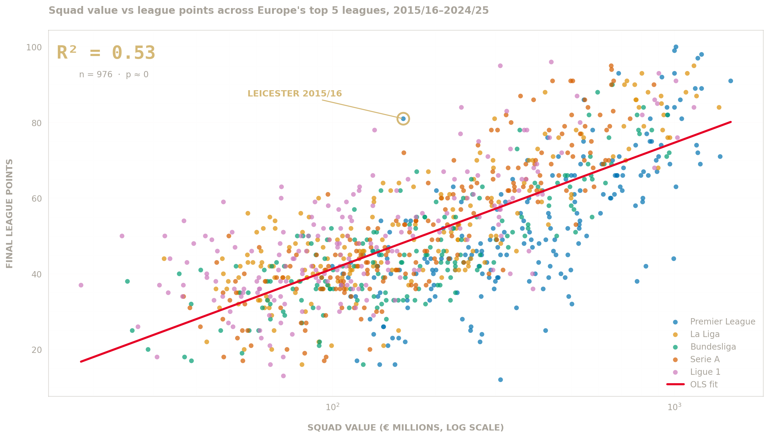
Figure 1 Source: Pooled OLS via Transfermarkt Squad Values
We took squad market value data from Transfermarkt, which estimates the current market value of each team’s playing squad in euros. We ran a simple OLS regression, taking the log₁₀ of squad value as the independent variable and final league points as the dependent variable.
The line slopes upwards, steeply. The data suggests a team worth ten times more than another tends to finish about 33 points higher on average; that is the difference between a Relegation Team and a Champions League place. The fit is tight enough that squad value alone accounts for 53% of the variation in points, with the remaining 47% attributable to everything else that happens in a football season, from managerial quality to injury luck to the run of a single hot striker.
With 976 data points behind the fit, the probability that this pattern arose by chance is effectively zero (p ≈ 5 × 10⁻¹⁶³). For a result like this, with this sample size, the relationship is as statistically significant as football data gets. But R² is a measure of association, not cause. Half of the variance being statistically explained by squad value means the half the line does not explain is worth half the story.
Leicester: An Outlier
In 2015 / 16, Leicester City won the Premier League with a squad worth €161 million, the seventeenth-most valuable in the league. The regression predicts that should have bought them 36 points, yet they finished on 81. A residual of plus forty-five, the largest in ten years of data.
Leicester’s Jamie Vardy scored 24 league goals that season, more than any other player in the top five leagues. Manager Claudio Ranieri’s tactics were widely praised for their effectiveness and the team had a run of injury luck that kept key players fit. They rode a wave of confidence that built on early wins and carried them through the season.
If nothing else, Leicester’s hot streak serves as a good reminder of the other half of this story. Regression cannot tell us everything, the lower the R², the less money itself matters.
Pooled Regression Summary Statistics
| Sample size (n) | 976 team-seasons |
| Leagues covered | 5 |
| Seasons covered | 10 (2015/16 – 2024/25) |
| R²R-squared. The proportion of variance in points that lines up with squad value. 0 means no relationship; 1 means a perfect fit. 0.533 means roughly 53% of the variation in points can be statistically attributed to squad value alone. | 0.533 |
| Slope (points per log₁₀ squad value €m)How many extra league points a team earns for each tenfold (10×) increase in squad value. A team worth €1bn is predicted to finish about 33 points above a team worth €100m. | 33.36 |
| InterceptThe predicted points total at squad value €1m on the log₁₀ scale (i.e. where the line would cross the y-axis). Negative because real squad values are far above €1m; not directly meaningful on its own. | −25.42 |
| p-valueThe probability the observed pattern could arise by random chance if no real relationship existed. A value this small (≈5 × 10⁻¹⁶³) means the relationship is as statistically certain as football data gets. | 5.22 × 10⁻¹⁶³ |
| Largest single-season residualThe gap between actual and predicted points for a single team-season. Leicester's +45.01 means they finished 45 points above what the regression predicted from their squad value alone — the largest such gap in the dataset. | Leicester 2015/16, +45.01 |
53% R² at essentially 0 p-value signals strong correlation within European Football. But it does not hold equally. The fit is tighter in some leagues than in others, and the leagues with the lowest R² are not the ones you would expect.
Finding Two
Where the money matters most
The pooled line holds across European football. But it does not hold equally.
Fitting the same regression league by league, we find that squad value predicts points more cleanly in some leagues than in others. The variation is wider than you would expect, and it runs in the opposite direction from the one most fans would guess.
The richest league fits near the bottom. Serie A fits the tightest.
Running the same regression against each League shows us that the correlation between squad value and points vary significantly between leagues. Serie A has the strongest correlation, Ligue 1 has the worst. Premier League, the richest league, ranks second to last.
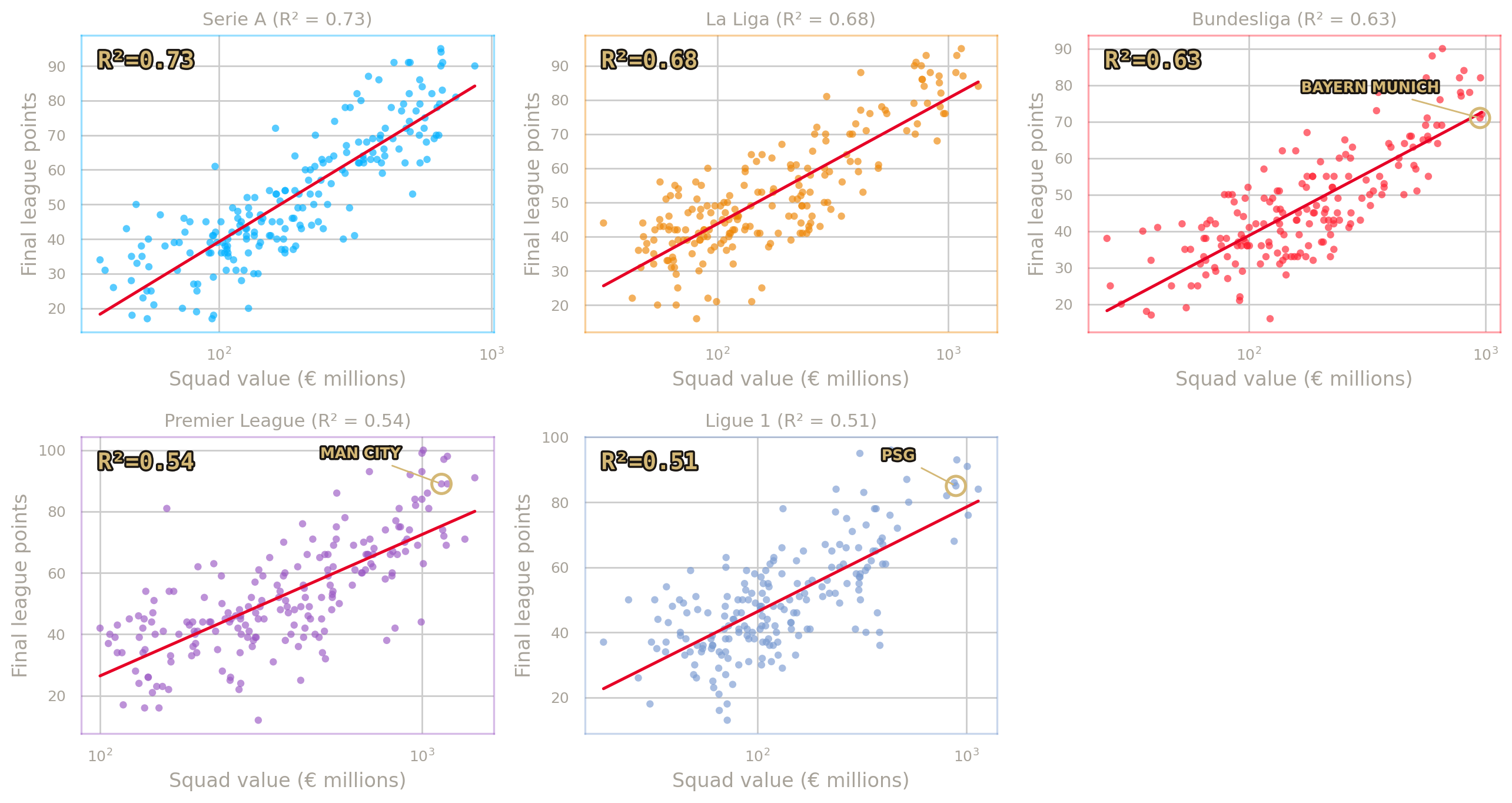
Figure 2 Source: Per-league OLS of Five leagues, ten seasons each · R² shown per panel
Each panel takes the same analysis from the pooled regression and applies it inside a single league. Taking squad market value on a log scale against final league points, we used OLS to fit a line through each league’s ten seasons of data, and calculated the R² for each fit.
The intuitive ranking, the one most fans would write down, puts the Premier League at the top. The richest league, the one with the most TV money and the most global attention, should be the one where spending most ruthlessly converts into table position. The data says the opposite. The Premier League’s R² of 0.54 is the second-weakest fit in the five. Serie A (0.73) and La Liga (0.68) sit ahead of it, and the only league with a clearly worse fit is Ligue 1 (0.51).
The leagues with the cleanest fits are the ones with the most even distribution of squad value. Serie A and La Liga both have a handful of big clubs, but no single dominant outlier. The Premier League has several big spenders, all competing with each other, which adds noise; Manchester City, Liverpool, Chelsea, Arsenal and Manchester United have all spent at the top of the league across the ten-year window, and not all of them have finished where the model would predict. Bundesliga sits in the middle. And the league with the worst fit, is the one that includes Paris Saint-Germain.
The Outlier Problem
Paris Saint-Germain have won Ligue 1 in nine of the last ten seasons. Their squad value has averaged roughly four times that of the next-most-valuable club in the league. On a per-league scatter, PSG sit alone in the top-right corner of the chart, with every other team clustered in the lower-left.
When a regression line is asked to pass through both an extreme outlier and a dense cluster, it gets pulled flat. The line that fits PSG also has to fit Brest, and Reims, and Lorient. The result is a slope that under-predicts PSG and over-predicts everyone else, and an R² that comes out worse than the data would suggest at first glance.
Counterintuitively, leagues with concentrated wealth fit worse, not better, than leagues with competitive spending. The same dynamic exists in the Bundesliga to a lesser extent, where Bayern Munich sit ahead of the field. The Premier League is noisy for the opposite reason: too many big spenders, none of them clearly dominant.
A certain ranking of how strongly money predicts points would be a satisfying conclusion, but the numbers don’t quite support it. With around 200 team-seasons per league, each league’s correlation comes with a margin of error wide enough to overlap its neighbour. Serie A and La Liga can’t be statistically separated from each other; nor can the Premier League and Ligue 1. The defensible reading is not a strict ranking but instead, a clustering.
The Correlation Tiers
| High | Serie A | 0.86 | 0.81 – 0.90 |
| High | La Liga | 0.82 | 0.77 – 0.86 |
| Middle | Bundesliga | 0.80 | 0.74 – 0.85 |
| Low | Premier League | 0.74 | 0.66 – 0.80 |
| Low | Ligue 1 | 0.71 | 0.63 – 0.78 |
The variation the model explains differs by league. The variation it leaves unexplained is where the more interesting question lives.
Finding Three
Above and Below the Line
Half the variation in points is explained by squad value. The other half is not.
That other half is where the most interesting questions sit: which teams beat the model, which fall short of it, and how much of what looks like overperformance is really the model’s geometry showing through.
Some clubs beat the model for a decade. Some lose to it.
Average residual against per-league OLS show Manchester City consistently beating the model, while Nottingham and Valencia fall short. Faded bars indicate short samples re-rated by promotion
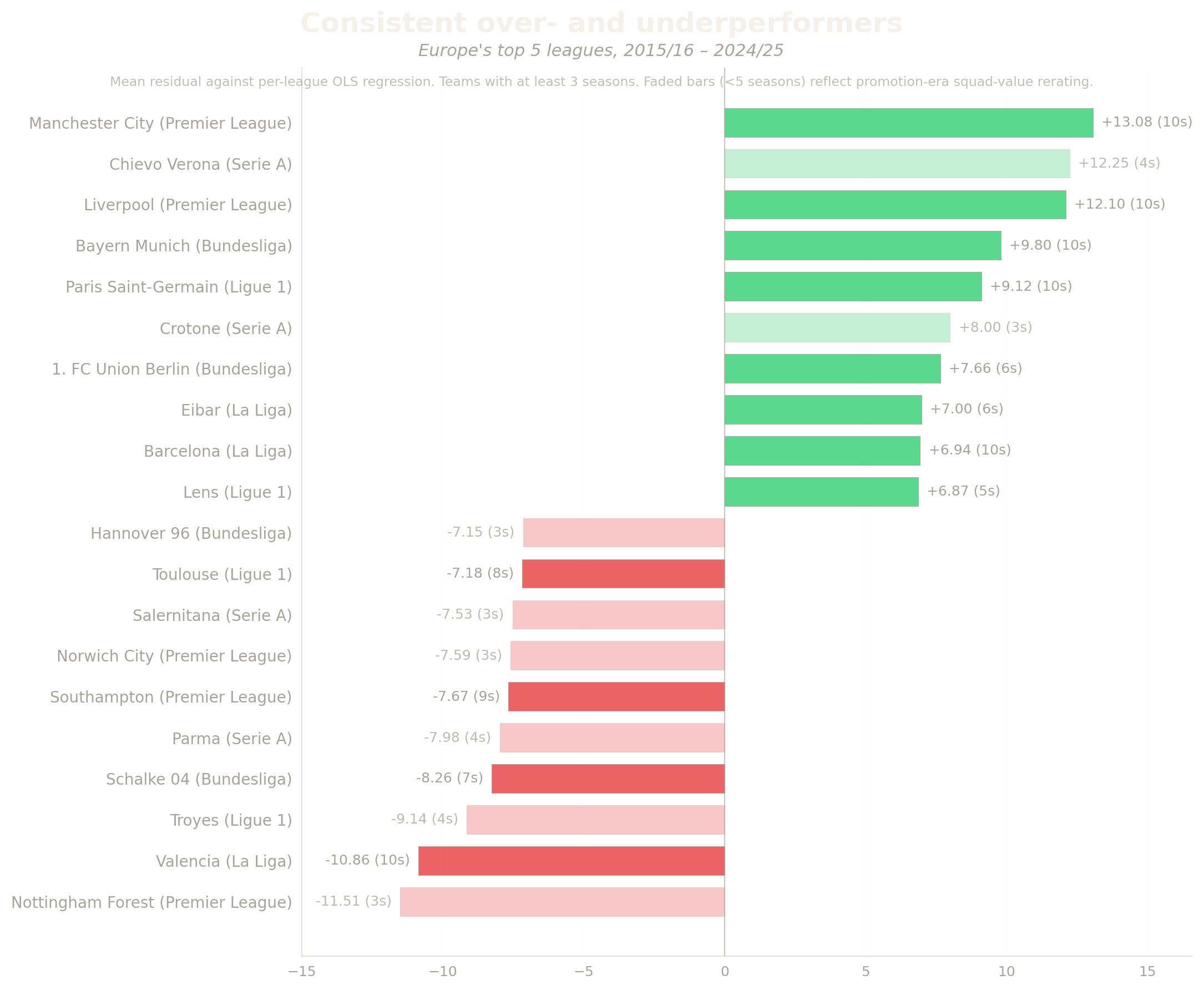
Figure 3 · Mean residual per club · ≥3 seasons in dataset · Sorted by average residual
A residual is the gap between what the regression predicts and what actually happened. A team with a residual of plus ten finished the season with ten more points than its squad value alone would suggest; a team with a residual of minus ten, ten fewer. Averaging a team’s residuals across all its seasons in the dataset gives a measure of consistent over- or underperformance against the model.
At the top of the leaderboard sit Manchester City (+13.08 across ten seasons), Liverpool (+12.10), Bayern Munich (+9.80), and Paris Saint-Germain (+9.12). At the bottom, Nottingham Forest (−11.51), Valencia (−10.86), and Schalke 04 (−8.26). The chart sorts every team in Europe’s top five leagues by average residual, with faded bars marking clubs with fewer than five seasons in the dataset.
The Structural Bias
The top of the leaderboard hides a model-geometry problem. Manchester City, Liverpool, Bayern Munich and PSG all sit far above their league regression lines. But that line is fit through every team in the league, including the underperformers. When a league’s biggest spenders are joined by clubs of similar value who do not deliver on it, the line gets pulled flat, and the genuine top clubs come out looking more exceptional than they really are.
The clearest case is the Bundesliga, where Bayern’s +9.80 residual sits alongside Schalke 04’s −8.26 across seven seasons, a real long-sample collapse from a club whose squad value has historically been near the top of the league. The same dynamic likely operates in the Premier League and Ligue 1, though the most extreme underperformers in those leagues across our window have been mid-table sides like Southampton and Toulouse rather than big-spending peers.
The Genuine Outperformers
Strip out the artefacts and the real story is the small clubs. Chievo Verona averaged +12.25 across four Serie A seasons on one of the smallest squad budgets in Italy. Four seasons is not enough data to be definitive, but four consecutive seasons of overperformance at that magnitude is genuinely interesting. Crotone’s three-season run produced +8.00 against the same backdrop. Union Berlin sustained +7.66 over six Bundesliga seasons. Eibar managed +7.00 across six La Liga campaigns, with a squad value that never approached the league average.
These are the model’s most genuine misses. None of them sit at the top of their league’s squad-value distribution. None of them benefit from the regression line being flattened by an underperforming rival above them. They are clubs that consistently won more points than money alone suggests, which is the original Leicester finding repeated in five different colours and at smaller scale.
The underperformer side carries its own structural caveat. Half of the bottom ten are recently-promoted clubs whose Transfermarkt squad values get re-rated upward at promotion before their actual performance level catches up; the chart fades those bars to flag the data gap. The genuine, long-sample underperformers are Valencia (ten Spanish seasons of consistent decline against their squad value), Schalke 04 (seven Bundesliga seasons of the same), and Southampton (nine Premier League seasons). These are the cases where the model isn’t being fooled by its own geometry, these are clubs where ten years of evidence point to systematic underperformance.
The model explains about half of what happens in European football. It explains some leagues more cleanly than others. And the teams that beat the model break into two camps: those that look like outperformers because of where their rivals sit, and those that are genuinely punching above their weight.
Methodologies, Questions and Exploration
What the line
doesn’t tell us
The regression shows us the pattern in the data, but does not explain the cause. Before we go to the verdict, let’s pull at what regression alone cannot answer.
The Premier League Paradox
The richest league has the second-weakest fit. Three candidate explanations are worth pulling on, none of them settled by the data here.
Five-way competition. Bayern wins the Bundesliga. PSG wins Ligue 1. The Premier League has five clubs spending at the top: Manchester City, Liverpool, Chelsea, Arsenal, Manchester United, and only one can finish first. The model can predict that one of the five will be near the top in a given season. It cannot predict which.
The European drain. Top Premier League clubs play Champions League fixtures from September. Six to eight extra matches per season, with travel and squad rotation. The model treats squad value as static. The cost of running a squad deep enough to survive two competitions isn’t visible to it.
The expensive bottom. Premier League TV money lifts even promoted clubs to squad values that exceed mid-table sides in other leagues. The model’s predictions for newly-promoted Premier League clubs are wildly optimistic. Their underperformance inflates the residuals at the bottom of the table without saying anything about money buying points.
Each would need its own analysis to test: separating European fixture loads, treating manager tenure as a control, comparing match-by-match form against a rolling squad value. Pieces of further study, not conclusions.
A Note on Method
Why log scale on squad value? Values span three orders of magnitude, from around €30 million to €1.4 billion. Doubling a club’s value from €30m to €60m matters more for league position than doubling from €700m to €1.4bn; a log axis spreads the points evenly across the chart and lets a single straight line describe the central tendency. Fitting in linear space would give Paris Saint-Germain and Manchester City disproportionate leverage on the slope and produce a worse fit on every other club.
Why Pearson r in section two but R² in section one? R² is the squared correlation. The numbers reported in the correlation tiers (0.86, 0.82, 0.80, 0.74, 0.71) and the R² values shown in the per-league panels (0.73, 0.68, 0.63, 0.54, 0.51) are the same information: 0.86² ≈ 0.74, 0.82² ≈ 0.68, and so on down. R² is the natural metric when describing a regression’s explanatory power. Pearson r is the conventional metric when comparing correlation strengths across groups with confidence intervals attached, because the Fisher z-transform that produces honest CIs is defined on r, not R². The tiers are not a different finding, they are the same finding in the conventional reporting metric for that kind of comparison.
Why measure residuals against each league’s own line? The leaderboard in Section 3 compares each club to its own league’s regression. E.g. Leicester to the Premier League line, Bayern to the Bundesliga line. The alternative would be to compare every club in Europe against a single line drawn through all 976 team-seasons. When we tried that, the bottom ten underperformers came out as ten Premier League clubs, and four of the top ten overperformers were Serie A sides, not because those clubs are particularly good or bad, but because the Premier League spends more per available point and Serie A spends less. Pooled residuals end up ranking leagues, not clubs. Per-league residuals strip that league effect out, and they are the only framing under which the leaderboard answers the question the chart claims to answer.
The Verdict
So what does money buy?
The pooled regression sets out the broad answer: across ten years of European football, squad value alone explains about half of where teams finish in their leagues.
01
Squad value explains about half of where teams finish. The pattern is consistent across ten years and five leagues. Spend more, finish higher.
02
But money buys points unequally. Serie A and La Liga, where wealth is evenly spread, fit cleanly. The Premier League (too many big spenders) and Ligue 1 (one dominant outlier) fit worst.
03
The teams that beat the model split in two. Manchester City, Liverpool, Bayern, PSG sit above their league lines partly because rivals like Schalke flattened them. The real outperformers are smaller, Chievo, Crotone, Union Berlin, Eibar, who sustained more points than money predicted on budgets nowhere near the league average.
Half the Season is Bought. The other half is played.
End of Piece · DS105W 2025/26